the printer’s mark

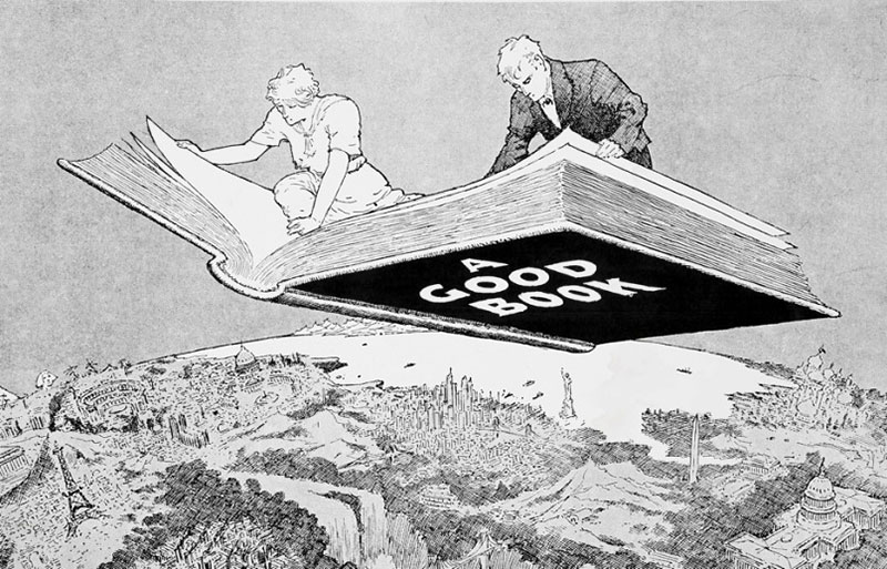
Winsor McCay, A Good Book (not the book in question)
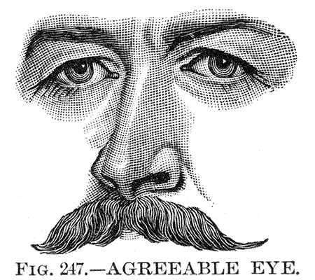
It is not that the book is badly designed. No. The typeface suits and the pages are pleasingly laid out out. There are suitable illustrations, photos of the poet at various stages in her career – the ordinary image-making of an attractive woman. No. The problem is that it is so poorly printed: the letters fizz into illegibility at their effete serifs, the images suffer at once from digital distortion (blockish jpeg artifacts) and from being printed at too large a screen so the details disappear between the dots. In one picture one cannot tell if a large hat casts an enormous shadow, or if the poet has painted her eyebrows on with Groucho-style greasepaint. In another, her face is reduced to a death’s-head with pinpoint rodent eyes and cavernous nostrils. A third, informal shot, could be of anybody’s grandmother, washed-out and pale in a room with too many modern conveniences and not enough comfort. What is to be done?
